| Sets | Parameters | Example |
|---|---|---|
| the lens | lens | lens=section |
| an organism | taxon, stage, den, zeros | taxon=worms:217452&stage=larva&den=per_10m2 |
| an ocean variable | var | var=temperature |
| the filters | years, q, depth, datasets | years=1990-2020&q=2,3&depth=250-350 |
| the summary | stat | stat=med |
| hexagon size | res | res=5 |
| the contour surface | interp, grain, surface, inputs, labels | interp=ok&grain=station&surface=se |
| the section | line, anom, cruise, view, exag, cam | line=90&anom=1&view=3d&cam=-121.2,32.6,7.6,55,-40 |
| the region | layer, region | layer=National+Marine+Sanctuaries |
| the map extent | map | map=-120.4,34.1,6.2 |
| the map layers | layers, data, datao, ramp, obs, lines | layers=noaa_onms_sanctuaries,data&obs=on&lines=on |
| the sea floor | bathy, bathyo | bathy=relief,contours&bathyo=0.5 |
| the Time panel | strip, yview | strip=mean |
| the panes | show, hide, max | show=depth&max=section |
| a station's card | station | station=<grid_key> |
| which release | release | release=vYYYY.MM.DD |
| the theme | theme | theme=dark |
| the welcome and tour | tour | tour=off |
| the attribution modal | modal | modal=sources |
1 Explore
Everything on this page runs on the same frozen release, so what you see in one product is what you get from another. Start with the Explorer; the rest of the page is where to go when you want one dataset, one table, or one query.
1.1 The Explorer
calcofi.io/explore is one web application for looking at the whole integrated database, for one organism (a taxon from the net tows and censuses) or one ocean variable (from the bottle, CTD, carbonate and weather series) at a time, through six lenses:
- Stations — every CalCOFI station as a dot, coloured by the summary of what you chose over the years, season and depths you set.
- Hexagons — the same summary pooled into hexagons of a resolution you pick, so the whole survey area reads at once.
- Contours — an interpolated surface over the stations, computed in the browser, shown with its own error.
- Cruises — one cruise at a time: its track, its stations, what it measured.
- Regions — summaries by boundary: sanctuaries, protected areas, wind areas, the CalCOFI regions.
- Sections — a vertical slice along a line, station by depth, as values or as anomalies against the one climatology every product subtracts (see The database).
calcofi.io/species/ and calcofi.io/measurements/ are the index — every organism or measurement, which datasets carry it, over what years; the Explorer is the map, opening already filtered on ?taxon= or ?var=.
Four things make it different from an app with a server behind it:
- Nothing runs anywhere but your browser. The SQL executes in DuckDB inside the page, against the release’s parquet files on a public bucket — the same bytes
calcofi4randcalcofi4pyread. There is no login, no rate limit and nothing to install. - The URL is the whole view. Lens, variable, stage, years, season, depth, theme: share the address and the other person sees your view.
- Every download is reproducible. A map exports as PNG with its title; a table as CSV with a
dataset_keycolumn; and the SQL that produced it can be copied for R, Python or a DuckDB shell. - Attribution is built in. Cite this data copies the release citation plus one per dataset in the view (see Cite this data); a Sources line names every dataset a view pools; the feedback button sends the view, annotated if you like, to the team.
1.1.1 Start the tour
The app carries a guided tour — Help ▾ → Take the tour, or press ? — that walks the same stops in the same order as the rest of this chapter, in the app itself. This page is the written version of that walk: one section per stop, with a picture of what you should be seeing and the part the tour has no room for. The app’s Help ▾ → Explorer guide opens this page.
The pictures below are screenshots of the live app reading the promoted release. Nothing in them is mocked up, so a control that has moved since is a bug in this chapter — the pencil in the margin edits it.
1.2 The anatomy
Every lens is drawn on one map with the same furniture around it (Figure 1.1). Reading it in the order the tour takes:
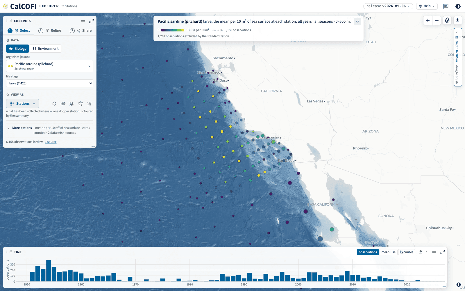
- The header names the release you are reading and lets you pick another; then Help ▾, the feedback bubble and the theme toggle, in the order every CalCOFI product uses. The word beside the wordmark is the lens you are in.
- The sentence at the top says what the map shows in plain words, with the colour scale, the observation count and — for a standardized biology view — how many observations the standardization excludes. Its ▾ turns the sentence into controls.
- The Controls panel floats at the top left with three numbered tabs: ① Select what you are looking at, ② Refine it, ③ Share it. Its footer counts the observations in view and the sources behind them.
- The map is the page (x, y): everything else floats over it. Hover a dot for its summary; click a station for its coverage card — every dataset measured there, by year and by month.
- Time (t) runs along the bottom: observations per year over the whole record. Drag on it to filter the map to a span of years.
- Depth (z) is the pill on the right edge. It opens into the water column for an ocean variable; drag a band to slice the map to those depths.
- The map’s own buttons sit in one row at the top right: zoom, the layers card, and the download that exports the map with its title or the table the lens draws.
1.2.1 The sentence is the controls
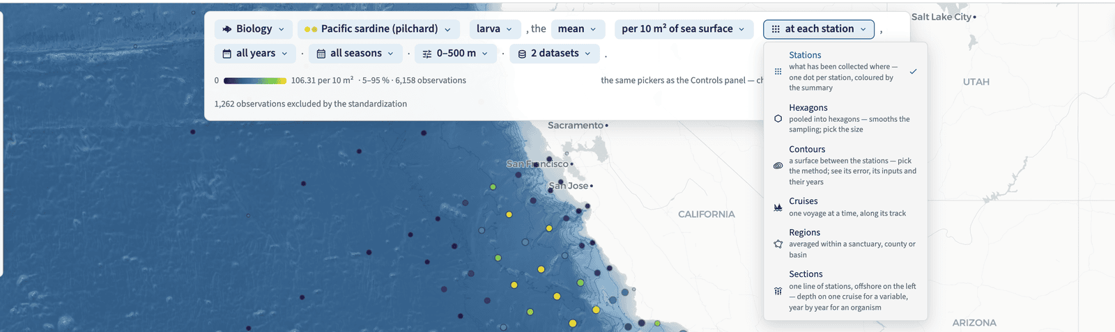
The title sentence is not a caption. Open its ▾ and every part becomes a chip whose menu is the same picker the Controls panel holds (Figure 1.2) — realm, organism or variable, life stage, statistic, standardization, View as, years, season, depth band, datasets. Change a chip and the map follows; the Controls panel shows the same choice, because the two read one state.
1.2.2 Select, Refine, Share
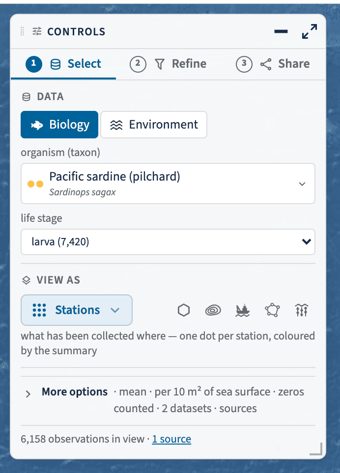
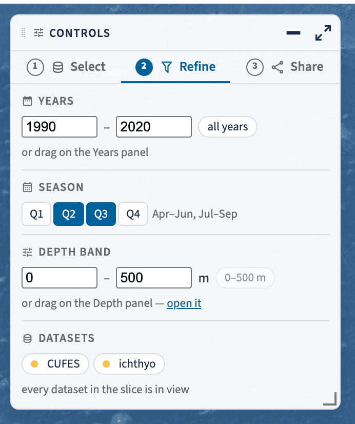
The Controls panel is three steps in order (Figure 1.3).
① Select is what you are looking at: Biology or Environment, then the organism (a taxon — species, genus or family) or the ocean variable, and the life stage that goes with it. The picker opens folded by category, each category with its icon, how many items it holds and a log-scale bar of how much data — type to search within it, or use the flat A–Z list. View as holds the six lenses: the active one full size with a line of help under it, the other five as icon slivers. More options is the disclosure that decides what is pooled: the summary statistic, how counts are standardized (per 10 m² of sea surface, per 1000 m³ strained, or the raw count), whether tows that were sampled and caught nothing count as zeros, one pill per dataset × stage, and the Sources line naming every dataset the average pools. A statistic is averaged across datasets that share the life stage and the standardization, and never across them — eggs are never merged with larvae, counts never with densities.
② Refine narrows it: the years (typed, or dragged on the Time panel), the seasons as quarters (the quarter of the cruise’s designated month, so a cast taken on 30 June on a July cruise is in the third quarter with the rest of its cruise; test_release.qmd asserts it for CalCOFI 2607), the depth band (typed, or brushed on the Depth panel) and the datasets in view.
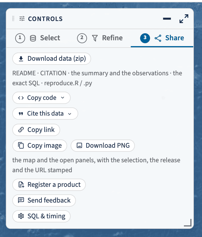
③ Share is everything that leaves the app: Download data (zip) — the summary and the observations, the exact SQL against the release’s object URLs, a README, the citations and reproduce.R / reproduce.py that re-run the query; Copy code for SQL, R or Python; Cite this data; Copy link; Copy image / Download PNG of the whole view with the selection, release and URL stamped in the footer; Register a product, Send feedback, and SQL and timing for what the browser actually ran.
1.2.3 Time, along the bottom
The Time panel (Figure 1.4) is the whole record, not the filtered slice: it keeps every year for context and shows the span you filtered inside it. Its modes are observations (how many per year), mean ± se (the selection as a time series) and cruises (a year × month calendar of what sailed). Drag across it to filter the map to a span of years.

1.2.4 Depth, at the right
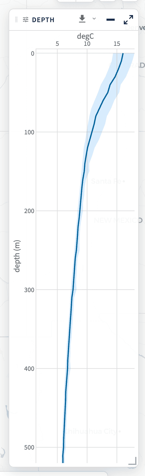
The Depth panel (Figure 1.5) is the water column for the current selection: the profile with its spread, in 10 m bins. Drag a band on it to slice the map to those depths. It starts folded to a pill and it never opens itself — it lights up when a pick that was sampled at depth arrives, and when a pick has no depth axis (a depth-integrated net tow) the pill says so instead of moving.
1.3 The six lenses
Six shapes of the same data, under the same selection and the same filters. Switching between Stations and Hexagons travels the dots to their hexagon centres — the one animation that shows what pooling does; every other change is a short cross-fade, and no lens carries dots it does not explain.
1.3.1 Stations
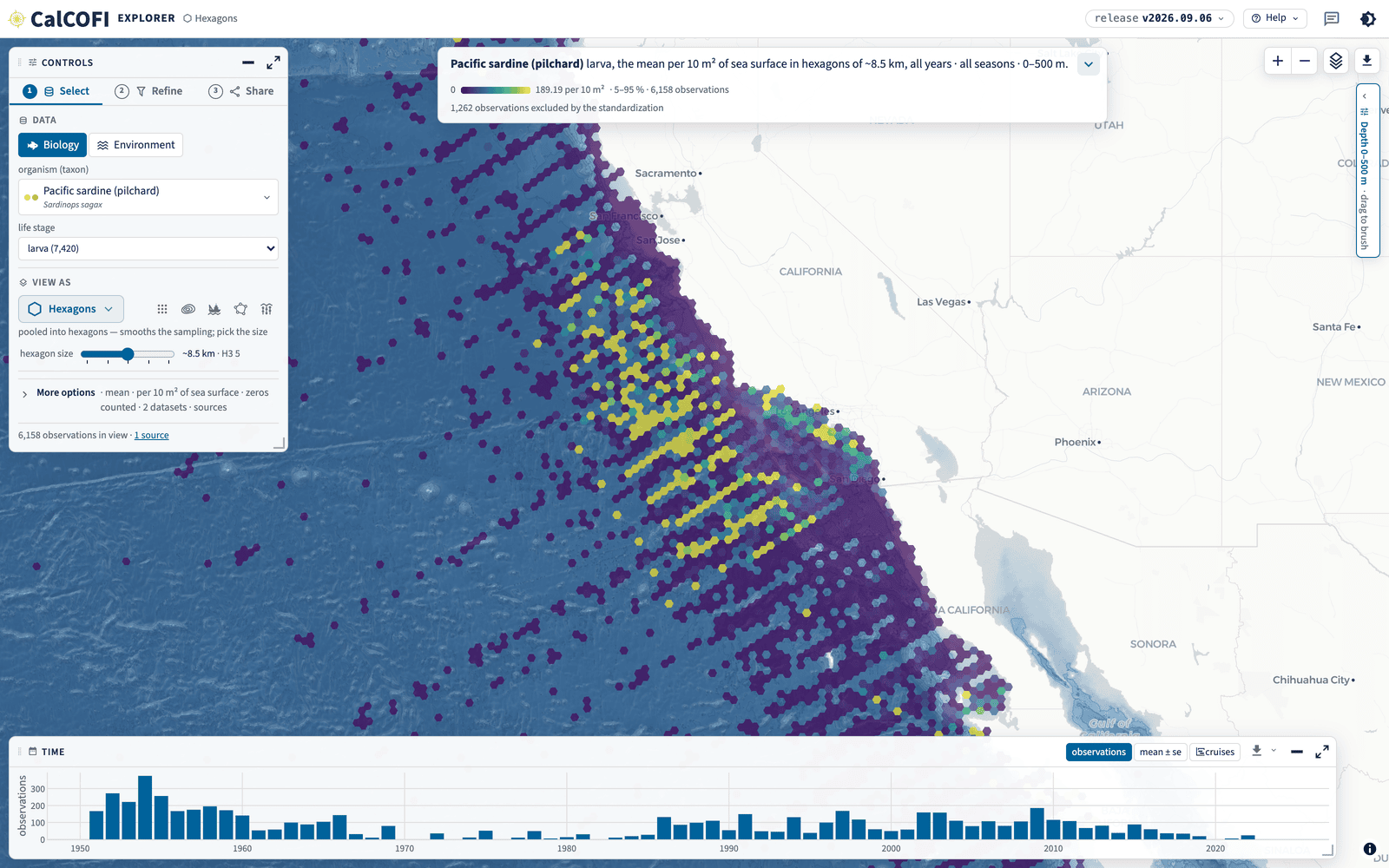
One dot per station, coloured by the summary of what you chose (Figure 1.1). The legend’s 5–95 % window sets the colours, so a few extreme stations cannot flatten the rest. Click a dot for the station’s coverage card: every dataset measured there, by year and by month. This is the lens for what has been collected where, and the one the app opens on.
1.3.2 Hexagons
The same summary pooled into H3 cells, with a size slider that runs from about 60 km to about 1 km (Figure 1.6). Pooling smooths the sampling — the grid’s repeat occupations stop reading as isolated dots — and the size you pick lands in the URL as res=. The hex_id behind it is the H3 index carried on every observation in the release (The database).
1.3.3 Contours
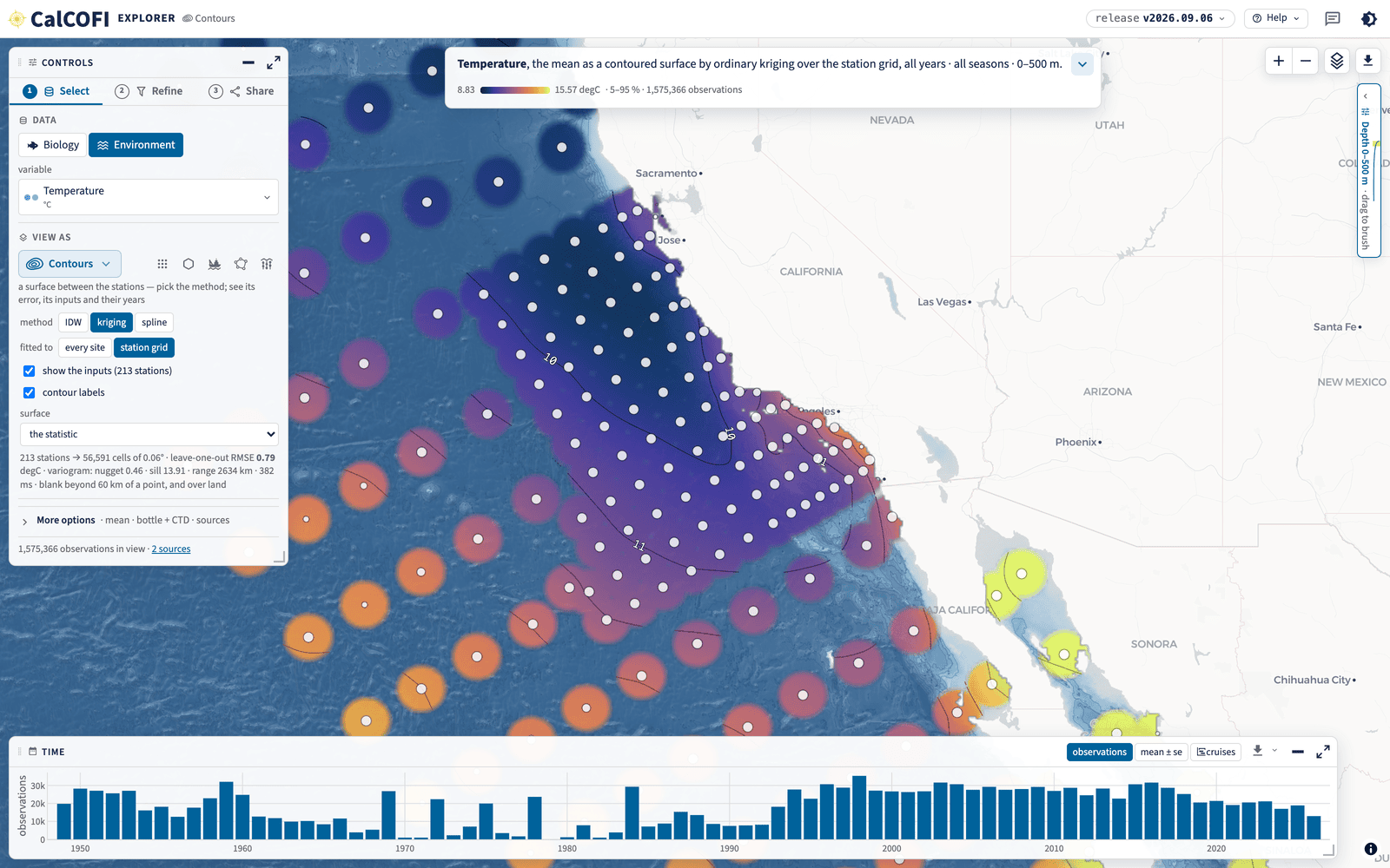
The Contours lens interpolates the point summary into a surface, in a Web Worker in your browser (Figure 1.7). Four choices are yours, and all four are in the URL:
- the method — IDW (inverse-distance weighting, what the superseded Contour Explorer drew), kriging (an exponential variogram fitted to the points) or spline (a thin-plate spline, the GAM
calcofi4r::pts_to_contours_gam()fits, over the station grid); - what it is fitted to — every site (each cast, tow or site at its own position, repeat occupations pooled) or the station grid (one point per grid cell);
- the surface — the statistic itself, its error (the kriging standard deviation or the spline’s standard error; IDW is a weighted average and has none), the observation density, the first or last year sampled, the 5th or 95th percentile, or their spread;
- what is drawn over it — the input points the surface was fitted to, and the level labels along the isolines.
Under the options, the fit reports itself: the leave-one-out RMSE, the variogram (nugget, sill, range) or the effective degrees of freedom, and how long it took. The surface is blank beyond 60 km from any point and clipped at the coastline, so the map never extrapolates and never draws ocean over land. calcofi4r::cc_interpolate() and calcofi4py.interpolate() are the same algorithm, pinned to the browser’s own output by a shared fixture, so a surface made in R or Python matches the map cell for cell (Access the data).
1.3.4 Cruises
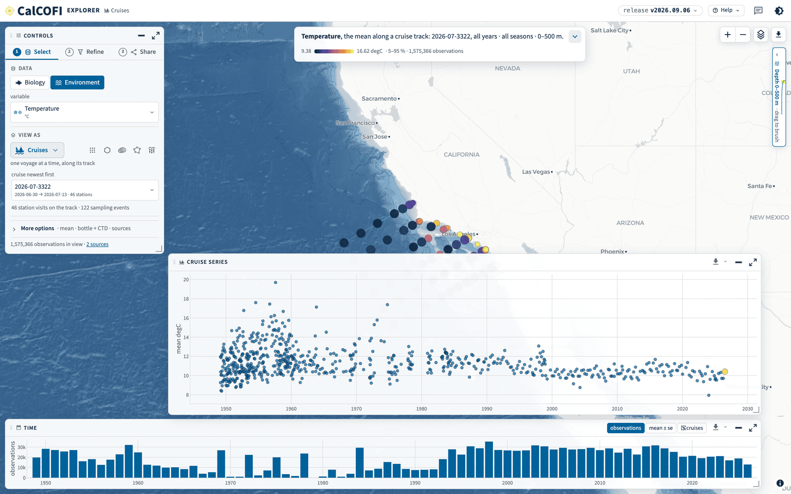
One voyage at a time (Figure 1.8): its track, its station visits coloured by what you picked, and the sampling events behind them. The Cruise series panel puts that cruise in the whole record — every cruise’s mean as a point, the one you are looking at highlighted — which is how you see whether a cruise was warm or cold for its season without leaving the lens.
1.3.5 Regions
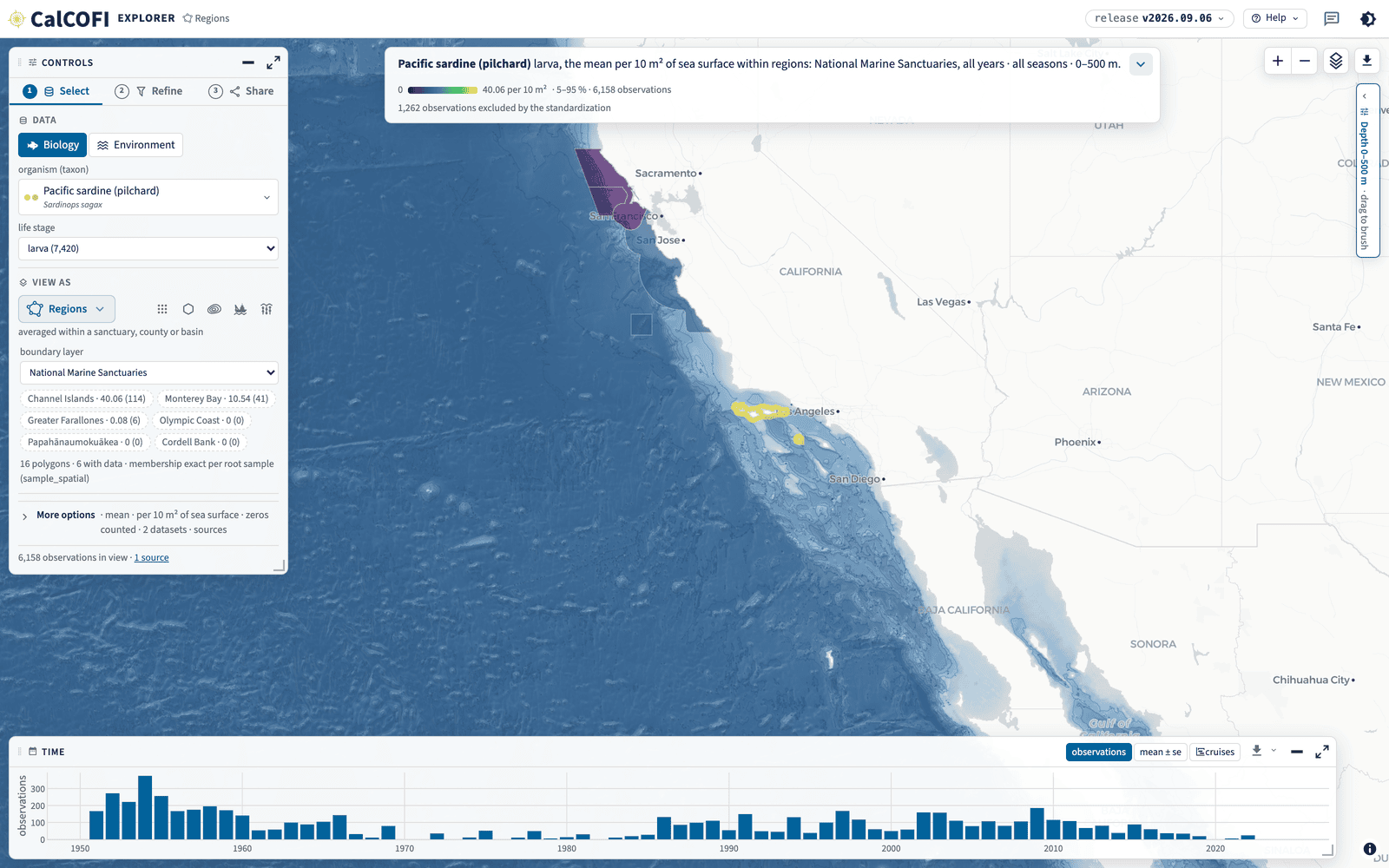
The same summary averaged inside boundaries (Figure 1.9): pick a layer — sanctuaries, protected areas, wind areas, counties, the CalCOFI regions — and each polygon is ranked as a pill with its value and the number of observations behind it. Membership is exact, from the release’s own sample_spatial table rather than a bounding box, and a polygon with no data says so rather than reading as a zero.
1.3.6 Sections
A section cuts one CalCOFI line, and its y-axis is the realm — this is the one lens whose shape changes with what you picked.
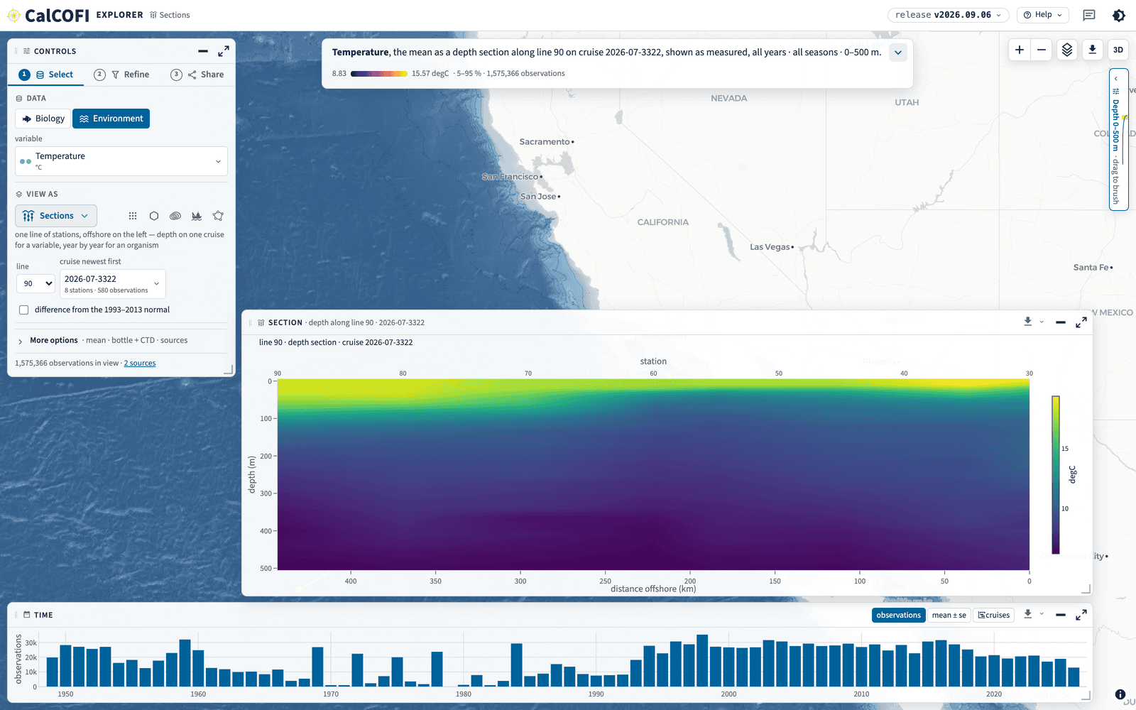
For an ocean variable it is a depth section: the stations along the line across the x-axis, depth down the y-axis, for one cruise (Figure 1.10). The checkbox difference from the 1993–2013 normal subtracts the release’s own climatology table — the mean for that station, the cruise’s month and its 10 m depth bin — so an anomaly here and an anomaly in ctd-transects cannot disagree (The database). A cell with no monthly baseline (an absent row, or one whose clim_mean is NULL because only its season passes the cruise floor) is left blank, never drawn as zero. Beside the checkbox, month · season picks the baseline: the cruise’s month, or its quarter (Q1 Jan–Mar … Q4 Oct–Dec, the release’s season_* columns), which fills stations whose month alone has fewer than five baseline cruises; the caption names the one shown (“the July normal”, “the Jul–Sep normal”). A release without the seasonal columns keeps the season button disabled.
The Hexagons and Contours lenses offer the same difference for an ocean variable, including the per-cast derived products (mixed-layer depth, chlorophyll maximum, integrated chlorophyll): each observation’s own baseline cell is subtracted before anything is pooled, an observation with no baseline drops out rather than counting as zero, and the lens says what share of the observations in view had one. The map draws the anomaly for the mean and median statistics; a count stays a count.
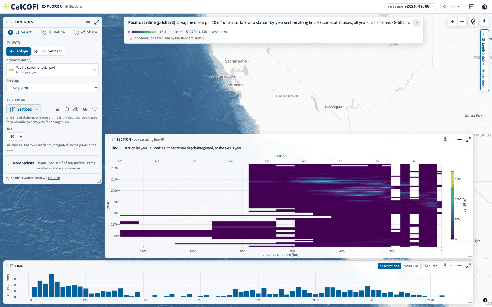
For an organism the tows are depth-integrated, so there is no depth axis: the lens draws a station-by-year section — the same stations across the x-axis, years down the y-axis, across all cruises (Figure 1.11). White is a station-year that was never sampled, not a zero.
Both are laid out like the map — offshore on the left, the coast on the right — and both carry two rulers on the x-axis: station number above, distance offshore below. They are one ruler, because a CalCOFI line is equidistant at 7.386 km per station unit, so the axis is linear in both at once.
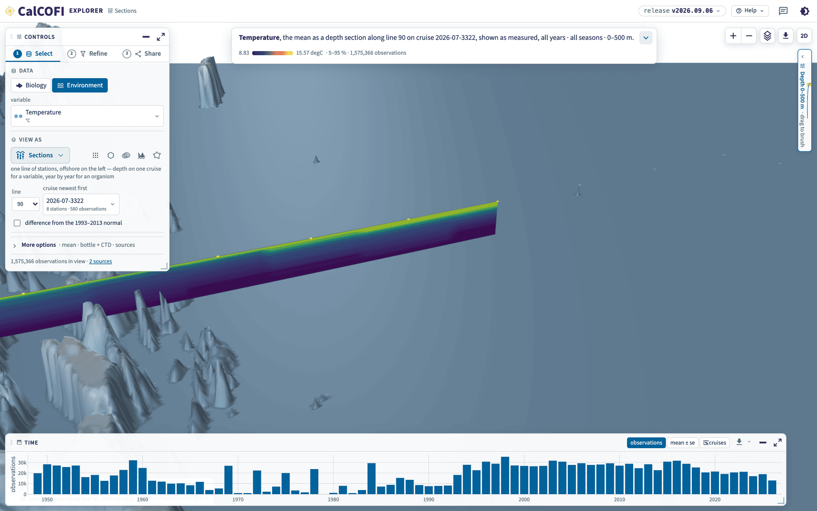
For an ocean variable, the 3-D button hangs the same section as a curtain over the GEBCO sea floor (Figure 1.12), with the station grid at the surface for reference: every station of the standard pattern as a dot with its number, a thread through each line and the line’s name at both ends. The camera is driven by dragging (shift-drag or right-drag rotates and tilts), by the rotate, tilt and compass buttons that join the map’s top-right row in 3-D (the compass resets the line’s own framing), or by the keyboard once the scene has been clicked (arrows pan, shift + arrows rotate and tilt, + and − zoom). The vantage travels in the URL as cam= beside the vertical exaggeration, so a shared link reopens at the same angle; 2D at the top right brings the flat one back.
1.4 Map layers
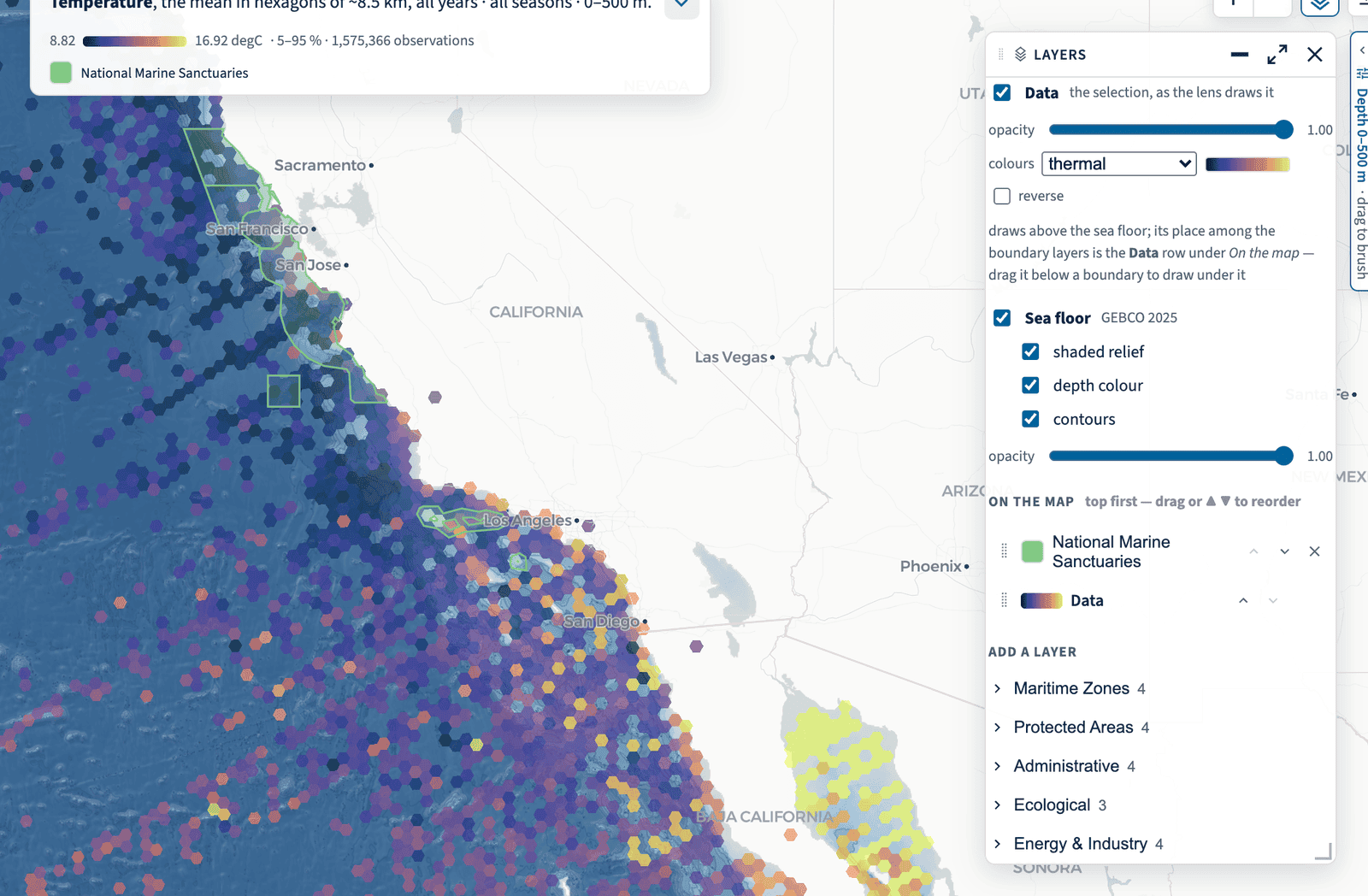
The layers button on the map opens one card for everything drawn under and over your data (Figure 1.13):
- Data — the selection as the lens draws it: on or off, its opacity, and its colour ramp (cmocean’s ramps, viridis and GEBCO’s, reversible). With no ramp chosen, the variable takes its cmocean convention — thermal for temperature, haline for salinity, ice for oxygen.
- Observations — every cast, tow or site in the selection at its own position, as a dot of the colour you pick (black by default), in every lens and on top of everything. It does not depend on the Data row: with Data off it shows where the ship sampled, over the sea floor and the boundary layers, with no summary colour (
data=off&obs=on). - Lines — each CalCOFI line threaded through its official stations and named at both ends, in every lens and with or without Data (
lines=on); with Observations and Data off it is the map of where the program samples (data=off&obs=on&lines=on). - Sea floor — GEBCO 2025 as three parts you can toggle separately (shaded relief, depth colour, contours) with its own opacity. It is the same bathymetry the 3-D curtain stands on.
- Basemap labels — the basemap’s own place names, road names, points of interest and water names, toned down so they never outrank the data (one grey, Regular weight, an opacity slider,
basemapo=), plus the island names the basemap carries but never drew; off (basemap=nolabels) for a data-centric view, with the isobath labels and the undersea feature names untouched. The names layer has its own opacity in its On the map row. - On the map — the boundary layers and the Data row in draw order, top first, re-ordered by dragging a row or with ▲ ▼. Putting a boundary above Data draws it over your data; putting Data above it draws the data over the boundary. The Data row is the sea surface: it and every row below it are clipped to the ocean by the coast, rows above it draw over the land too.
- Add a layer — the boundary registry by group: maritime zones, protected areas, administrative, ecological, energy and industry, and the Reference group — the undersea feature names of the IHO-IOC GEBCO Gazetteer (banks, basins, canyons, seamounts, escarpments, labelled at a zoom set by their rank) and, for comparison, Esri’s raster ocean reference. The names are on from the start, above the data and absent from the legend, with their opacity slider under the row; remove the row to turn them off (
layers=offin the link).
The coast itself is not a layer of the card: it is always drawn over the sea floor and the data from OpenStreetMap’s land polygons (the same coastline the basemap’s water comes from), so a 390 m bathymetry cell or a 10 km contoured cell never spills onto land, and the basemap’s roads, county, state and country lines and labels stay on top.
Every choice — which layers, their order, their colour, fill opacity and line width, the sea floor’s parts and opacity, the data ramp — is view state and lives in the URL, so a shared link, a bookmark and a feedback report all reopen the same map. The boundary and reference layers are PMTiles archives on gs://calcofi-files-public/_spatial/, built by ingest_spatial.qmd from the registry metadata/spatial_layers.csv and listed per release in spatial_layers.json (Chapter 7).
1.5 Every pane, the same controls
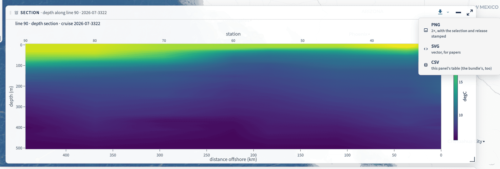
Every panel — Controls, Time, Depth, Layers and each lens result — is a floating pane with one title bar and the same four controls (Figure 1.14): move it by dragging the bar (a double-click sends it home), collapse it to a labelled pill on the nearest edge, expand it to fill the map (Esc restores) and resize it from an edge or the corner grip. Positions are remembered per browser and per viewport; which panes are folded or expanded lives in the URL.
The ⬇ on the bar exports that pane on its own:
- PNG, at 2×, with the selection, the release and the view URL stamped in a footer;
- SVG, vector, for a paper;
- CSV, the pane’s own table — the same rows the download bundle carries, each with a
dataset_keycolumn, so a pooled row still names the datasets it pools.
Nothing leaves the app anonymous: every figure footer and every CSV names the datasets in view, which is what makes the citations in Cite this data possible to honour.
1.6 Share: every view is a URL
There is no view the address bar does not carry. Share → Copy link hands over the whole state — including the map extent — and pasting one back reproduces it exactly, on any machine, without an account. Table 1.1 lists the parameters; src/state.ts in CalCOFI/explore is the authority that reads and writes them.
One caution about a link kept for a long time: station= carries a grid_key, and a grid_key keeps its form between releases but not necessarily its polygon, so a saved link made against an earlier release can open a different station’s card in a later one (the grid key). Pin release= where the link must keep meaning what it did.
Two other parameters are worth knowing by name. ?theme=dark and ?theme=light set the theme for one view (Figure 1.15) — the app otherwise follows the theme you chose anywhere on calcofi.io — and ?tour=off suppresses the welcome card and the tour, which is what makes a screenshot of the app deterministic (see Products, brand and uptime).
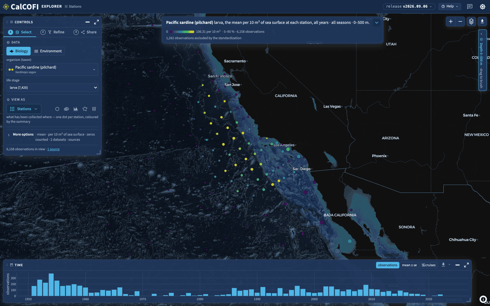
?theme=dark. Every product on calcofi.io honours the same parameter and the same stored choice.
The pattern also runs the other way: every dataset page on calcofi.io/datasets links into the Explorer as ?datasets=<dataset_key>, and each of its variables as ?datasets=<dataset_key>&var=<variable>, so “show me this dataset, in this variable” is one click from the record rather than a search.
1.7 Help, the tour and feedback
Help ▾ in the header (Figure 1.16) holds the tour (? replays it), the Explorer guide — this chapter — Start here (the welcome card, with its two doors and four worked questions), About (what the app is, the release, the datasets with their providers and spans, the credits), Data Sources and Attribution (one row per dataset, with citation, licence, DOI and contacts; also reachable as ?modal=sources), Register a product and the keyboard map.
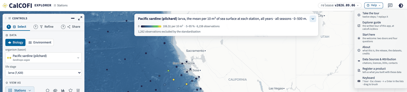
The speech bubble beside the theme toggle is feedback. It captures the view you are looking at, lets you mark it up — arrow, circle, rectangle, pen, text — and sends the picture with your note, the view’s URL, the release, the viewport and the theme: to the team by mail, to a sheet, and as a public issue in the app’s repository without your email address. That is the point of the URL being the whole view: “that spike looks wrong” arrives as something anyone can open and see. Register a product is the same dialog in its second form, for telling us what you built with these data.
1.8 One dataset
Every dataset in the database — and every one CalCOFI holds but has not yet ingested — has a page at calcofi.io/datasets: what it is, who made it, its years and area, how to cite it, and every place it can be reached (the Explorer, the packages, ERDDAP, its archive of record). The page is generated from the same record the portals read, so it is never a copy of anything. Metadata & the ingest loop says where its words come from.
1.9 One table, one query
- calcofi.io/db-schema browses the schema of any release: tables, columns with units and descriptions, the entity-relationship diagram, the datasets and the measurement-type registry. The database and Keys and integrity are the narrative it lacks.
- calcofi.io/db-query runs SQL against the release in your browser — a library of queries to start from, and a shell. Access the data shows the same queries from R and Python.
1.10 The other applications
The Explorer superseded the server-side applications that each showed one of its lenses; they keep serving, and their cards on calcofi.io say what replaced them. The table reads the same cards.
| Product | Status | |
|---|---|---|
| CTD Explorer | live | Visualize CTD casts — temperature, salinity, oxygen and more — by cruise, station and depth, from individual profiles to whole-grid maps. |
| CTD Transects | live | Cross-shelf temperature, salinity, oxygen, density and fluorescence sections along every CalCOFI line, for every cruise since 1993 — drawn nearshore to offshore with no station picking, and mapped so you can see where each transect is. Opens on the anomaly against each station's day-of-year climatology (warmer or colder than usual, and by how much), with the measured value one click away. Flags each cruise's processing stage, and shows the uncorrected sensor series on cruises whose bottle merge has not run. |
| Pollutants Explorer | live | Map pollutants in the Southern California Bight from the Regional Monitoring Program via SCCWRP. |
| Station Explorer | live | Discover what's measured at each CalCOFI station — station × dataset coverage (time, depth, observations, surveys) built from the integrated release database, with variable search and dataset crosswalk. Continues the 2026 UCSB student capstone. |
| Contour Explorer | superseded by CalCOFI Explorer | Visualize and download CalCOFI oceanographic data in map, time-series and depth-profile views. |
| Cruise Explorer | superseded by CalCOFI Explorer | Cross-dataset observation explorer — compare coverage across cruises, datasets and depths, with shareable deep-link URLs. Superseded by the Explorer's cruises lens (Ben, 2026-09-08); kept serving. |
| Hexagon Explorer | superseded by CalCOFI Explorer | Explore decades of fish larvae and oceanographic bottle data together — filter by taxa, depth and season over dynamic hexagon maps, time series and depth profiles. Superseded by the Explorer's hexagons lens (Ben, 2026-09-08); kept serving. |
1.11 Student contributions
Student teams at UCSB, UCLA and UCSD have built portals, dashboards and stories on the database; their repositories are archived and their sites keep serving.
| Product | Status | |
|---|---|---|
| 75th Anniversary Timeline | live | An interactive TimelineJS journey through 75 years of CalCOFI milestones — from the 1949 founding after the sardine collapse to the NORPAC expedition, the 1957–58 El Niño, CTD sampling, and the first all-female research cruise. — CalCOFI–CA Sea Grant Data Storytelling Internship, 2024, Anneliese (Annie) Adams |
| Offshore Wind Monitoring | live | An interactive map for planning ocean monitoring around California's floating offshore wind areas — toggle Essential Ocean Variables and long-term monitoring programs to reveal gaps in baseline datasets. — SIO Masters Capstone, 2024, Eliza Thomas |
| Larvae Dashboard | archived | Explore CalCOFI fish-larvae (ichthyoplankton) abundance over time and space — filter by species or habitat across seasons and decades, with trend, correlation, stability and spatial views plus CSV/PDF export. — UCSB Data Science Capstone, 2026, Joy Chang, Abhijit Brahme, A. Senthil, Chengcheng Fang, Kaeya Mehta, Shenyi Jiang |
| CA Ocean & Coastal Monitoring Map | live | Statewide inventory of California ocean and coastal monitoring programs within 12 nmi of the coast — hex-grid coverage at 1/3/5 km, survey transects, discharger stations, bathymetry, monitoring gaps, wind energy areas, and marine protected areas. — UCLA Capstone, 2026, Betty Huang |
| Capstone App | archived | Spatial and temporal visualization of the CalCOFI bottle dataset — the first student capstone built on the database. — UCSB CCDSP Fellowship, 2022 |
| Hypoxia Story | archived | A scrollable story of hypoxia in the California Current Ecosystem and its changing oxygen levels over the past 71 years. — CalCOFI–CA Sea Grant Data Storytelling Internship, 2024, Mallika Gupta, Anneliese (Annie) Adams |
| Marine Mammal App | archived | Marine mammal eDNA detections and visual sightings visualized against oceanographic conditions on the CalCOFI grid. — UCSB Data Science Capstone, 2025 |
| SaferSeafood App | archived | Personalized fish-consumption advisories for Southern California anglers — DDT levels predicted by species and catch location. — UCSB Bren MEDS Capstone, 2024 |
| Station Data Portal | archived | Map-based discovery of what is measured at each of 115 CalCOFI stations, with live variable search and auto-generated ERDDAP, Euphausiid and ZooDB queries. — UCSB Data Science Capstone, 2026, Nicole Xu, Aashish Krishnan, Qiongwen (Lucy) Cao |
1.12 Reports built on the data
The Channel Islands National Marine Sanctuary condition report reads CalCOFI through calcofi4r — its forage assemblage page is a worked example of a report that regenerates from the release. The status chapter records what each contract period delivered.